
 Once upon a time, Byrne was a fine storyteller, both in terms of writing and art. His dialogue was often cheesy, his plotting was sometimes clumsy, but through his own work and the work of some top-notch editors, he managed some of the best-remembered runs in comics history. I haven't read much of the Fantastic Four or X-Men issues that really made him famous, but you can't deny how good the first year or three of Superman following the Crisis reboot (and the Man of Steel reboot, to boot!) were fantastic comics. Over the course of a few years and three separate series, Byrne and co. (with a healthy helping of Marv Wolfman, I know) put together the foundation for Superman as we know him.
 And his art! Byrne's figures were carved from freakin' stone! Chiseled jaws, sturdy muscles--there's a reason they put him on Superman! Okay, so characters had a tendency to look alike, but I never said the man was George Pérez. You could distinguish Maggie Sawyer from Lois Lane, and that's really what counts.
Then, Byrne became the go-to guy for character revamps. "Well, ten years ago, the man did a fantastic Superman revamp, let's give 'im carte blanche to make Wonder Woman cool again." And I'll admit, it got me to read Wonder Woman for awhile (that, and a subscription deal at DC). I didn't come in at the beginning, though I would like to see some of those stories, with Darkseid and the like. But, what I read wasn't terrible--it reintroduced the "invisible" plane and gave us a new Wonder Girl, after all. But, it tended to be mediocre, up until it got downright incomprehensible. Byrne added an unnecessary new layer to Donna Troy's already horrendously confusing origin, then killed Diana, made her the Goddess of Truth, put her mother in the WW costume, and sent her back to the 1940s to iron out continuity problems that never really existed. Because Johnny thought there needed to be a 1940s Wonder Woman.
Okay, but JSA did some nice stuff with that in Our Worlds at War, and it hasn't really done anything to continuity, so I can't fault that too much. But what about the art?
This was where I learned that Byrne shouldn't ink Byrne. What was clear, crisp, and chiseled in 1986 under some other inker, now looked sketchy, blotchy, and overinked.
Then, there was the horror of Spider-Man: Chapter One. Somehow, I ended up with several issues of this garbage. Peter Parker and Doc Ock have their origins inexplicably connected--now, the explosion that grafts the arms to Octavius's body also engulfs Parker, and the spider-bite is insult to injury. His house gets robbed because he got a new computer, and...something. I blocked out the rest. Suffice it to say, Byrne's sledgehammer approach to the revamp missed the point of Stan Lee's subtle, insignificant spider-bite turning insignificant Peter Parker into a character who was anything but subtle. The art was worse than WW, looking sketchier and rougher than ever.
And then there was the Doom Patrol fiasco. And his funny ideas about Etrigan and Darkseid that favor rejecting thirty years of continuity to restore the characters to their Kirby originals. Shades of Chuck Austen. Anyone ever hear of "growth"? I happen to *like* that Etrigan rhymes. Especially when someone does it well, like Alan Moore or Joe Kelly.
But what I'm really talking about here is Action Comics. Since Simone and Byrne came onto the title, I've had a hard time getting excited about it. I've liked what little of Birds of Prey that I've read, and I like Villains United a lot, but only the newest issue really drew me in (and how! Damn if Dr. Psycho isn't a creepy screwball).
Yet, I've noticed that all the hard, chiseled features that define Byrne in my Brayne...er, brain, have been traded for proportions so poor that I can recognize how poor they are, amorphous faces, and wholly interchangable features. I didn't realize how bad it was until I saw the side-by-side comparisons of Byrne's pencils with the finished art over at Lying in the Gutters. People have been criticizing the inker, Nelson DeCastro, for changing Byrne's pencils, but take a look:
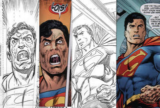

You know, the biggest complaint I have about the inks is that Superman's head is *way* too big in the second panel of the top image. And Byrne's messy hair makes Superman look a lot more stressed out than DeCastro's helmet-hair. But the pencils? In image 1, Superman has no forehead. In the first panel of that image, his eyes are too big, spaced too far apart, and his pupils aren't even pointing in the same direction. Superman has a super-lazy-eye. He looks like his face is melting. In the second panel, he should have a lot more head to accompany a face that big. It looks flat and deformed.
Besides that, Superman in the second image sure looks dynamic and imposing...from the waist up. What's he kneeling on? Why is he kneeling in the air? DeCastro did a little for the image, but there's no changing the fact that it's a bad pose that makes Superman look disproportionate, and makes his legs look stubby.
And then there's this:

Is she supposed to be one of the Joker's victims? Was Byrne penciling a Batman story? Because that crazy broad's smile sure as hell ain't natural. Her face is all skewed to the lower left. There's no way that's anything approaching a natural chin. And Superman's teensy forehead and lazy-eye return!
Once upon a time, John Byrne drew dynamic characters who looked strong and bold and imposing. They were proportionate to a fault and stylized, but they looked damn good. Now, his art looks lazy, rushed, and amorphous. It lacks the solidity and sharpness of his old work, and the people who would criticize an inker for trying to make his pencils passable, rather than recognize the failings of an aging artist, are blinded by his previous talent. Maybe Byrne is still capable of high quality work, but he certainly phoned in those pencils, and Nelson DeCastro did his best to make them work. Or, maybe John Byrne's artistic talents went to the same talent Valhalla as Chris Claremont's writing ability.
In a related note, Byrne asked that a reference to the Doom Patrol be omitted from the most recent issue of Action, for continuity purposes. Meanwhile, the whole of fandom requests that Byrne's Doom Patrol series be omitted from continuity for quality reasons. As far as I know, he still hasn't addressed his Doom Patrol's place in continuity, or why it's any more deserving of existence than the critically-acclaimed DP work by Grant Morrison. This is like shoving yourself into the second spot in a line and then bitching at the person behind you for standing so close. If you're going to wedge a series into a shared universe without explaining how it exists without upending decades of continuity, then don't expect anyone to pay attention to it.
Similarly, if you're going to ignore decades of continuity so you can return a character 'to his roots,' then don't complain when no one else shows the same selective disregard for history that you do. Etrigan's a rhymer, dammit.
3 comments:
I agree with every word in this post. I had a subscription to Fantastic Four during the Byrne run and it was awesome. His art was dynamic and interesting. The stories were really cool.
Now, though...Jeez!
Also, I'm having a harder time separating the artist from the art due to the weird things Byrne has said over the past few years.
Excellent examples on the pencil-to-ink differences, by the way.
You're absolutely right, Tom. I'm not a Byrne-hater by any means, but it is a shame to see a marked detioration in his once dynamic and powerful art, to the extent that I can't bear to look at it.
I got into Byrne at the tail end of his career; I got the (excellent) X-Men via the Classic series, and got the Fantastic Four, even Namor, West Coast Avengers, Next Men and even his other Dark Horse stuff. But his Wonder Woman was the beginning of the end for me; I think I lasted 18 months before I couldn't justify buying it anymore. His slapdash inking, which he might consider 'looser' or more natural, is just messy and unprofessional and is horrid to look at, let alone pay money for.
I haven't bought a John Byrne comic since, which appears to have been a good decision. At least we still have the old books to enjoy...
Post a Comment